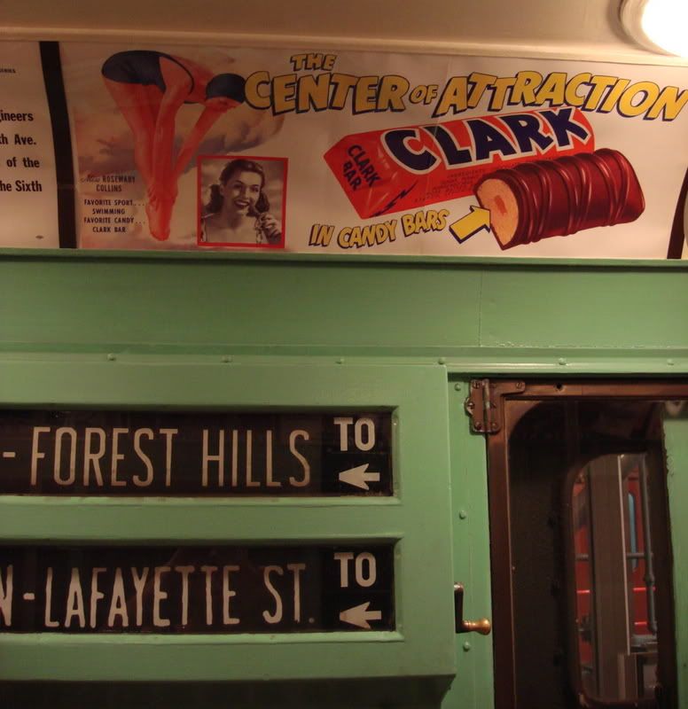
 Clark Bar: The center of attraction in candy bars
I like history, I'm fascinated by graphic design, and I love to travel, so maybe it's only natural that I would be completely captivated by signs and maps. Hence, one of the highlights of
our recent trip to the New York
Transit Museum was the use of vintage ads and maps in the subway cars and the collection of train signage on display.
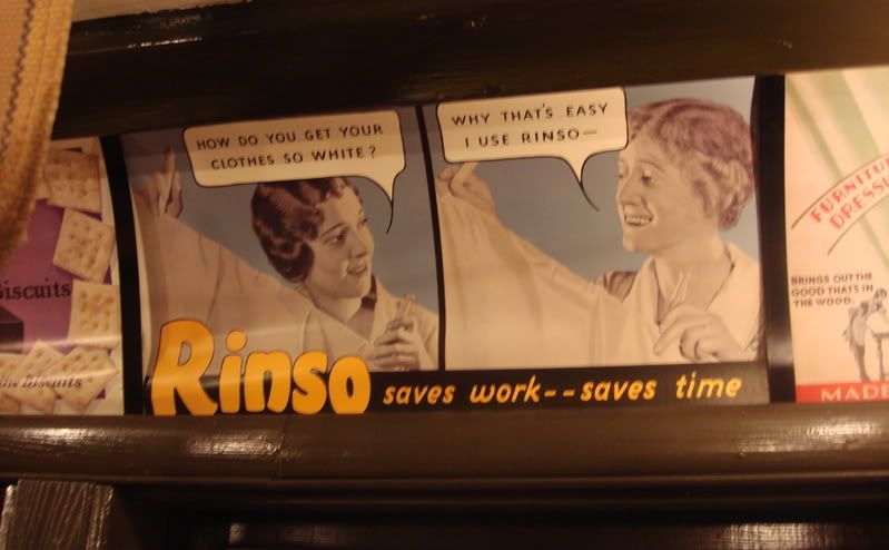 "How do you get your clothes so white?"
"Why that's easy, I use Rinso--"
Rinso saves work--saves time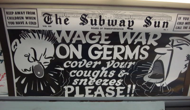 The Subway Sun says "Wage War on Germs:
Cover your coughs and sneezes please!!
Keep away from children when you have a cold."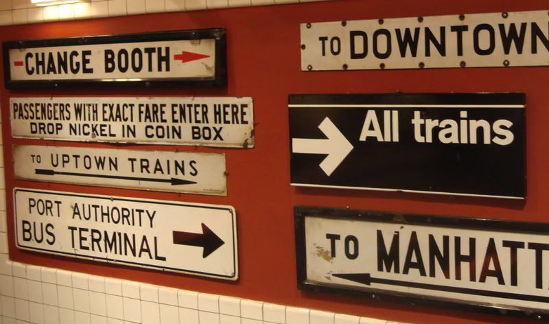 Subway signs...
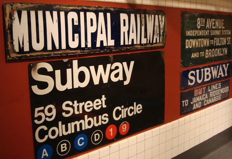 ...old and new.
59th Street/Columbus Circle was my stop for a while when I worked as an internet copywriter.The Evolution of a MapI won't start at the beginning--that would be
1904, with the IRT line--but with the 1939 World's Fair. If this sort of thing interests you, you can click on the maps to make them bigger. Lots more info (and even
more maps) can be found at
nycsubway.org. If this sort of thing is not your cup of tea, tune in another time for more cats and knitting and stuff because the following will probably make you weep with boredom.
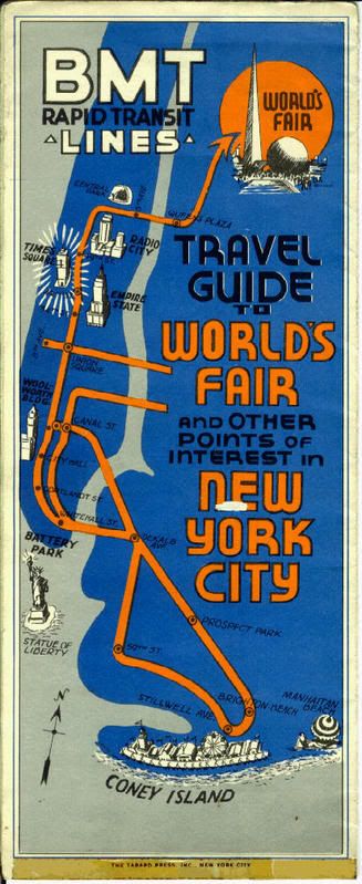
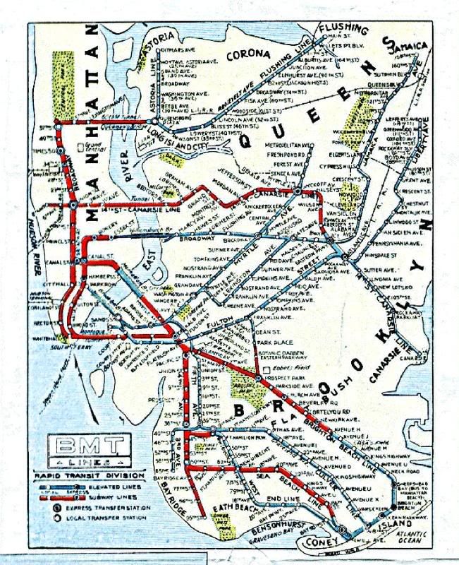 In 1939, New York had three different transit systems--the IRT, the IND, and the BMT. Each line had its own trains and its own maps. These three lines were unified into one city-owned transit system in 1940. This map shows the BMT (Brooklyn-Manhattan Transit) line in 1939 (pre-unification).
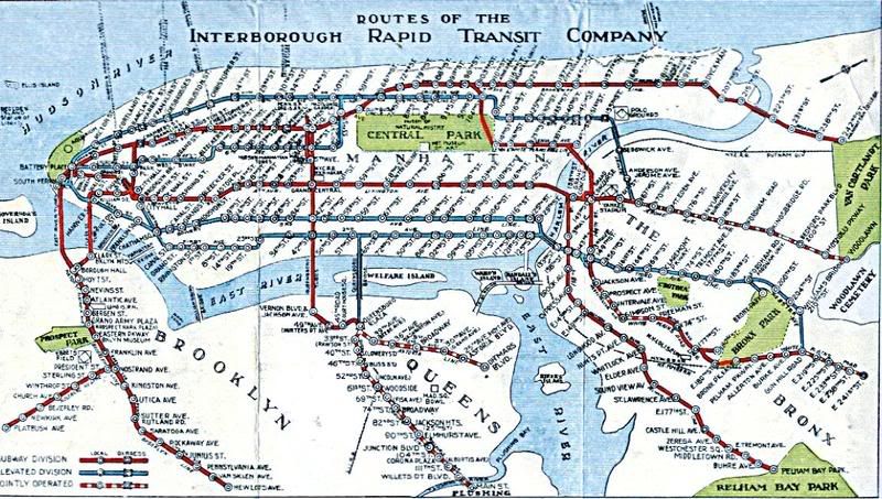 This map shows the IRT (Interborough Rapid Transit) line, also in 1939. I like the orientation of the map, with North to the right. In other words, Manhattan is at the top, and appears horizontally--you can make out Central Park at the top center.
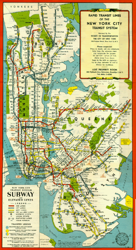 A 1948 map shows all three lines now on a single map. Unfortunately, the unification of the subway lines led to the demise of the elevated trains, which the city couldn't afford to keep running along with the subways.
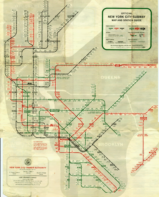 A modern, if rather colorless, update from 1959.
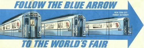 Remember the Bluebird (later to become the Redbird Reef) traincars? Here they are, on the cover of the map for the 1964 World's Fair.
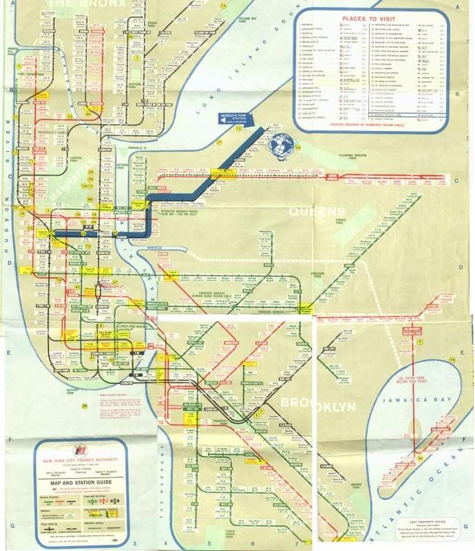 The 1964 map. The dark blue line marks the route to the Fair.
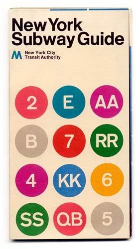 So cool, so mod in 1972. But we all recognize the signature circles with the letter or number inside to designate each line, which still look crisp and modern today--36 years later.
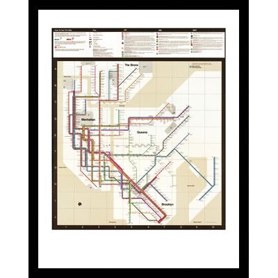 Massimo Vignelli's sleek, modern 1972 map speaks to its times. Because people had expected a map rather than a schematic graphic, many were left feeling cold by this design and the map was completely recreated in 1979. It hasn't changed much since. However, Vignelli's map was such a classic that Men's Vogue chose to reissue an updated version in May 2008 to benefit Green Worker Cooperatives, and the limited edition prints sold out in no time at all.
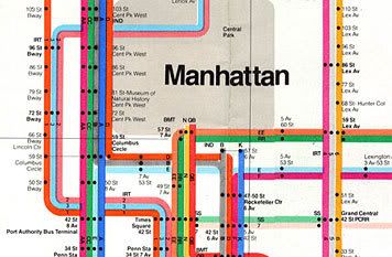 Detail of the Vignelli map. That grey bit is Central Park.
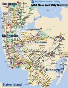 This is more like the version most of us are familiar with.
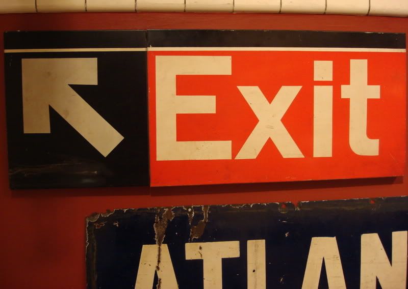


8 comments:
I have to admit I'm not crazy about Vignelli's map (maybe I'm just so used to the other one after using it for 20 years? lol) but I have to say his subway signage--designed back in 1966--with its clean proportions and crisp Helvetica font still looks good. http://www.vignelli.com/vignelli/home/transportation/nysub.html
Interesting to see the beginning of "cover your coughs" signage... hopefully "wash your hands more frequently when you have a cold" came soon after!
We love the Transit Museum, its a fun place to visit. We especially like the old trains and old turnstiles. Its so neat!
Our train maps are like the Vignelli one...I quite like them. Clean and uncluttered.
Rinso...I remember mum using that when we were kids. I haven't seen it for years.
Thank you so much for explaining what the initials stand for...I have often wondered.
The Vignellis maps remind me of what I seem to remember the Paris Metro map looking like. I believe I read that it was much like the London Underground map that had already been in use for decades at the time.
You know us Americans--so literal, even with our maps. lol
I wonder if they make Rinso anymore?
And some people still refer to the lines as BMT, IRT, etc. In places there are still references--like in the tiles in the stations--to the lines this way.
I forgot to mention that IND stood for Independent City Owned Rapid Transit Railroad. It opened in 1932.
I love looking at old street signs and maps, too! They are so interesting. Thanks for sharing these.
I love old maps. No, they don't make Rinso anymore. (I have no idea, I'm just saying that. I doubt it though. It was probably bought out by Clorox or something.)
And museums! I love museums.
As for Rinso, I got so curious I went to Wikipedia. Apparently Rinso was made by Lever Bros. (later Unilver) but was still available through the 1980s, when it was mostly replaced by another of their brands, Surf.
"However," says Wikipedia, "Rinso is still being made by Unilever for the Turkish, Asian, and Central American markets. In 1992, the Southern California-based '99 Cents Only Stores' purchased the rights to the name "Rinso" from Unilever for use in the United States. Rinso brand cleaning supplies are now prominently displayed in their stores."
Post a Comment